September 4, 2015

Cover Story: Creating On the Verge’s Kick-Ass Cover

I am so in love with On the Verge’s cover. Every time I look at it I’m filled with warm fuzzies. The credit goes to my absolutely amazing designer Daniel Cullen. Daniel has been designing covers for 20 years and it shows. He’s been running his current studio, Page & Jacket, since 2003, and has an incredible portfolio of work. I was immediately taken by his aesthetic and knew it would be a great fit for the theme and tone of On the Verge. On top of that he’s a really cool guy and super easy to work with!

All it took to get him started was a 45 minute phone conversation and a couple of emails back and forth with the elements of the story that I wanted him to consider as he designed. Here are the major bullet points I gave him.

  1. The book takes place in Seattle and the city is almost like a character in the story. It’s in the fall so everything is damp, dreary and atmospheric.
  2.  There is a painting by Franz von Stuck titled Sin that is at the core of the story. I know that securing the rights to use that image on the cover might be tricky/expensive, but using it as inspiration might be a good alternative.
  3. While the setting is dark and dreary the story is actually about a color hunt: cobalt blue, carmine red and gamboge yellow. The main characters must source these colors from a host of fairytale creatures including goblins, Baba Yaga and  a Cambodian spirit of the dead called an ahp.
  4. The story is dark and intense. Definitely not YA.
  5. It absolutely has to look good as a thumbnail since that’s how most people will see it for the first time as they are searching for something new to read on Amazon.

About a month after our initial conversation I opened my email and near-fainted at the beauty of the cover options he sent me (not really an exaggeration). I’ve included all the runners-up below with a little explanation of why I didn’t choose them.

On the Verge_3a

On the Verge_3b

This set, one with a black and white city and one with Seattle in color, is probably my least favorite of all the options. It’s striking but doesn’t really hint at the story in any tangible sense. And the way the colors are presented reminded me of marbled paper which isn’t really the vibe I was going for.

On the Verge_5b

On the Verge_5a

This set was Daniel’s favorite, particularly the one without the city. He felt it was hypnotic and mystical, and I agree. But again, I really wanted the cover to be a frame of reference, a shorthand, for the story itself, and I didn’t think these quite did that although they make amazing thumbnails!

On the Verge_2b

On the Verge_2a

These two, but especially the one with black font and a black and white Seattle, were close contenders. I really liked the way the colors seem to be threatening the city while also being intriguing and beautiful. And the first one has that cool contrast between the dark font/city and the vibrant swirl of sky. But then I saw this next one…

On the Verge_4a

This was almost my cover. I love the simplicity. It’s clean and modern, but mysterious. And again there is this that fabulous tension between the blackest black of the background and that floating column of color. Visually I was smitten, but I kept coming back to the story, and I just couldn’t see it reflected here. So then there was…

On the Verge_1b

On the Verge_1a

These two had it all! The colors are distinct but intertwined, they are vibrant but threatening, and they hover over the city in smoky columns in a way very similar to how I describe the Verge when it appears in the story. Overall there was that dark and brooding quality, but not too much so. They looked great as thumbnails and blown-up large. Winner, winner, chicken dinner!

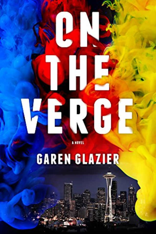
I thought the black and white city in first one was a bit too dark so we went with the color option, but I asked him to make Seattle a bit bigger, tweak the yellow, and fix the way the colors curled over the letters. Et voilà…

On-the-Verge_WEB

The final cover for On the Verge. I seriously couldn’t be happier. It was an absolute blast having so much say in the cover of my story. Traditionally published authors often have very little input in the design, and so for a control freak like me this has been one of the best parts of being an indie author and making my own rules.

The cover is one of the major ways books get sold. It is a crucial part of my marketing, and I wanted it to look super polished and professional (reference these self-published beauties for the opposite end of the spectrum).

As I mentioned in a previous post I can’t wait to start writing a new story for many reasons, and one of them definitely is getting to work with Daniel again on another amazing cover project.

Look him up at pageandjacket.com.

Leave a Reply

Your email address will not be published. Required fields are marked *

Hit enter to search or ESC to close